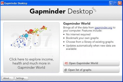
Gapminder Desktop is an application that allows you to create interesting graphic presentations, offering by default statistical data on different general topics, such as Child Health, Climate, Poverty, Education, Technology and others.
Once you have selected the topic which interests you, you will be able to prepare your presentation by introducing your own data in the graph or by using the data updated automatically from gapminder.org. You can select the countries you are interested in by ticking their corresponding box from the country list, you can choose a certain color to represent a certain country and you can define the period of time to be considered in your statistical analysis. After you have selected the data you wish to include, you can visualize how things have evolved over the period of time you have selected and adjust the speed with which you want the graph to display these changes.
The graph can be displayed in two modes. The first one is the chart, in which case the countries you have selected will be represented by the colored bubbles that will display their names once the mouse cursor is placed over them. The second mode displays the statistical data on the world map. The speech bubbles representing the selected countries will still be displayed, but they will be positioned precisely on the countries they represent.
To sum up, Gapminder Desktop can be used by business people who are in need of a tool for their business presentations or for performing statistical analyses. It can also be a good teaching aid for teachers or professors who need to prepare lectures or presentations for their students.
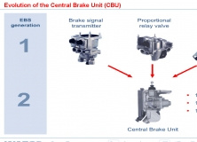
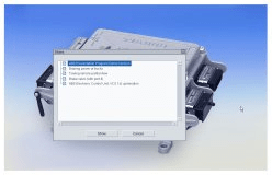
A presentation and simulation program for the use in WABCO training sessions.

Let Christmas comes alive on your PC desktop with these beautiful 3D Xmas scenes


Comments